-
Digital Marketing
We help you to use your digital potential. For a strong positioning, more visibility and more leads.
Get Growth ready
With the BEE.Transformance model, we bring continuous and profitable growth to your company. A new mindset for your team.
Industries
We transform your challenges into opportunities through the experience we have gained from projects in these industries.
-
HubSpot Services
As a HubSpot Diamond Partner, we help you implement your digital growth strategy with a focus on performance - by implementing and integrating new and existing systems as well as 3rd party apps.
HubSpot Thought Leader
As a HubSpot Diamond Partner with +50 certifications, host of the HubSpot User Group Zurich, HubSpot Trainer and HuSpot User Champions, you have access to in-depth HubSpot expertise.
HubSpot Solutions
The BEE.Theme offers you more creative freedom than any other theme on the market. Whether you're a beginner or a professional, a creative mind or a digital agency - with the BEE theme, you can easily unleash the maximum power for your pages in HubSpot CMS.
-
BEE.Blog
Knowledge around digital marketing, digital sales, technology, data intelligence and employees.
Knowledge Base
Pure knowledge: everything essential concentrated, compact, digitally prepared for you and ready to download.
What is inbound?
The most effective way to successfully combine digital marketing and digital sales.
-
BEE.Team
The BEE.Performers: many different characters - with one thing in common: the fascination for a digital world.
References
More than 100 large and small companies have already started with BEE: to more visibility, more performance, more growth.
Invest
Participate in the growth of BEE and become part of the BEE Growth Story by purchasing Digital Share Tokens.
We're hiring
Become a BEE.Performer! Are you ready for your own transformation?
Orange is the new black: 5 Branding Design Highlights
Welcome to the zesty world of orange! This vibrant hue has been captivating artists and designers for centuries, from the ancient Egyptians who used it to symbolise the sun, to the Dutch masters who famously captured it in their still-life paintings. But in the world of branding and marketing, orange is more than just a pretty colour – it's a powerful tool for capturing attention and conveying energy and enthusiasm. In 2023, the possibilities for incorporating orange into your branding are endless, and we're here to explore how you can make the most of this dynamic hue to create brand assets that are both eye-catching and effective.
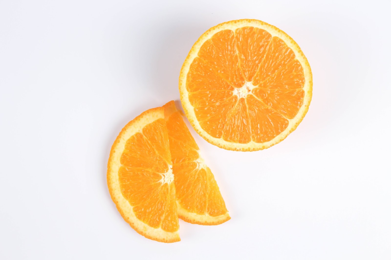
Photo by Chang Duong on Unsplash
Famous brands that use orange
Orange is a bold and energetic colour — the perfect choice for brands that want to grab attention and stand out from the crowd. There are plenty of well-established companies that leverage this vivacious hue, and you'll no doubt recognise a number of the notable examples we discuss below.
1. Nickelodeon

Nickelodeon, the popular children's television network, uses orange as its primary colour in its branding design. The bright orange hue conveys a sense of fun, energy, and excitement, which are all qualities that the network wants to associate with its brand messaging. The colour has become so synonymous with the brand that it's often referred to as "Nickelodeon orange."
2. Harley-Davidson
Harley-Davidson, the iconic motorcycle manufacturer, uses orange as a secondary colour in its branding design. The orange hue represents adventure, risk-taking, and freedom, which are all qualities that the brand wants to associate with its products. By using orange sparingly and in combination with black, Harley-Davidson creates a rugged and powerful visual identity that speaks to its target audience.
3. Home Depot
Home Depot, the home improvement retailer, uses orange as its primary colour in its branding design. The bright orange hue conveys a sense of warmth, energy, and approachability, which are all qualities that the brand wants to associate with its products and services. The colour also helps to make Home Depot stores easily recognisable and stand out from its competitors.
4. Fanta
Orange is a very important colour in Fanta's branding, as it is not only the colour of the drink itself, but it also plays a key role in shaping the brand's overall image and impact on customers. By using orange in its branding, Fanta is able to create a sense of fun, playfulness, and adventure that appeals to younger audiences in particular.
5. HubSpot
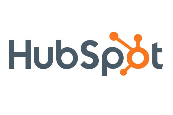
HubSpot, a popular marketing and sales software company, uses orange as a primary colour in its branding. The company's logo prominently features a stylised orange "H," which stands out against a navy blue background. This combination of colours creates a bold and eye-catching visual identity that is easily recognisable.
Beyond its logo, HubSpot uses orange throughout its branding to communicate its brand values of creativity, energy, and innovation. For example, orange accents are often used in HubSpot's marketing materials and website design, such as in call-to-action buttons and graphics. This reinforces the company's brand message of helping businesses to stand out and be successful in a competitive marketplace.
How to use orange in your branding
Play with gradients
Orange looks fantastic in gradients, and it's a great way to add depth and dimension to your branding design. By using different shades of orange, you can create a stunning visual effect that draws the eye and captures attention. Gradients can be used on everything from logos to backgrounds and can help to create a sense of movement and energy in your design.
Combine orange with contrasting colours
Another effective way to use orange in branding design is to pair it with contrasting colours such as blue, green, or purple. The contrast between these colours creates a dynamic visual effect that immediately captures attention and makes your branding design pop. This approach works particularly well in logos and marketing materials where you want to create a sense of excitement and energy.
Use orange as an accent colour
If you're not ready to go all-in with orange, you can still incorporate it into your branding design by using it as an accent colour. By using orange sparingly, you can add a pop of colour to your design without overwhelming your audience. This approach works particularly well in web design, where you can use orange to highlight important elements such as call-to-action buttons or links.
Embrace the psychology of orange
Orange is a colour that's associated with energy, enthusiasm, and excitement. It's also a colour that's often used to promote food and drink products, as it's believed to stimulate the appetite. By understanding the psychology behind orange, you can use it in your branding design to create a sense of excitement and make your audience feel hungry for your product or service.
Experiment with different shades of orange
Finally, don't be afraid to experiment with different shades of orange in your branding design. From bright, bold oranges to soft, muted peach tones, there's a shade of orange to suit every brand and every message. By playing with different shades of orange, you can create a unique and memorable branding design that sets you apart from your competitors.
Conclusion
Like a ray of sunshine breaking through a cloudy day, the colour orange can bring a burst of energy and warmth to your branding design. It's like a spark that ignites excitement and enthusiasm in your audience, making your brand stand out from the rest. Whether you use it as a bold stroke of paint or a subtle hint, orange can infuse your brand with a powerful vitality that resonates with your customers. It's a colour that exudes confidence and empowerment, like a beacon of light that guides your brand towards success. So, take advantage of the potent force of orange and let it elevate your branding design to new heights.
Is orange the new black for your business? If you're looking to create a fresh and juicy website without the hassle of hiring an entire webdesign team, you can reach out to us. As the only HubSpot Diamond Partner with our own HubSpot theme, we design your high-performance website with UX/UI-oriented web design and a focus on lead generation based on the HubSpot CMS and optimised for all devices. So, if you're ready to squeeze a little orange into your branding and have a highly effective and customer-centric website, let's talk!
Related Posts
HubSpot Marketplace: 5 Great Templates for Your CMS
Giuliano Campaniello | 30 Mar 2023
Without an exceptional website, does your business even exist? It’s your job to create a highly functional and customer-centric digital platform that works day and night ...
reading time: 9min
Zum Blog
404 Page: Best Practices and Creative Examples
Natalie Majolo | 19 May 2022
Ah, the awkward HTTP 404 page… A visitor has used a URL on your website, and the server says, "No, buddy, that's not here." Others like to call this an "error page", but ...
reading time: 6min
Zum Blog
5 Webdesign Trends for 2023
Tim Bittins | 9 Mar 2023
It’s 2023, and the internet is alive with web design trends that are all about creating excellent user experiences (UX). In just five short years, it’s estimated that ...
reading time: 15min
Zum Blog
