Ah, the awkward HTTP 404 page…
A visitor has used a URL on your website, and the server says, "No, buddy, that's not here." Others like to call this an "error page", but in marketing, we like to be optimistic! And so, we view a 404 as an opportunity.
Sure, something's gone wrong, and the URL hasn't provided the required content, but this doesn't have to be the end! If you're smart about your 404s, you can keep visitors engaged and revert them back to other (less dodgy) pages on your website.
Of course, you shouldn't make a habit of cluttering your website with 404 pages, and your web team should be proactive about site hygiene. But, since we are only human, it's important to make those inevitable outdated links as friendly as possible.
Why do 404 pages matter?
Traditionally, 404 pages are, quite literally, dead ends. When a visitor gets served the "Page Not Found" message, they may immediately suspect that:
- this is an unsafe site,
- this is an outdated and irrelevant site,
- this site doesn't have anything they're looking for;
or, they may think all of these things all at once!
So, as you can deduce from all of these unwanted conclusions, it's critical to ensure that the 404 page doesn't become the finish line for your visitor's interaction with your website.
Back in the day, a simple, white background and straightforward text saying "404 Error: Page Not Found "may have been okay – what did anyone know about the Internet, anyway? But now, expectations have changed, and user experience (UX) is all part of the service delivery. And, at a time when the web is saturated with competitor sites, it's essential to leverage engagement and focus on retention. If that's not incentivising enough, remember that Google is monitoring your site for user experience, so if your bounce rate is through the roof, your site's SEO will suffer!
How can I make my 404 pages better?
The content management suite you’re using should allow you to customise 404 pages.
If you’re using HubSpot and would like a simple solution that we’ve personally developed and tested on a wide variety of highly successful websites, then check out the Bee.Theme here.

The strategy you use is really down to your brand’s style and how you typically approach your customers. Here are a few different types of 404 pages:
1.The Entertainer – This type of page uses humour, sometimes in a self deprecated way, to apologise for the issue while also providing information that redirects the visitor to another relevant page.
Examples:
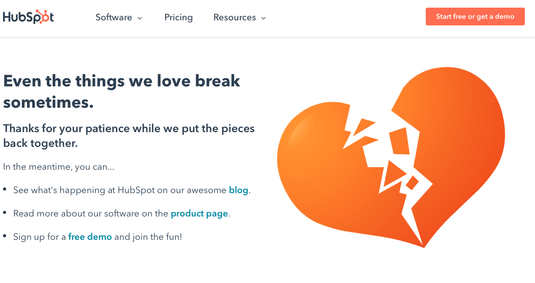
HubSpot’s always ready with a pun to make the visitor feel better about a broken link. While keeping things light, they also help the visitor redirect to another page that may be of interest.
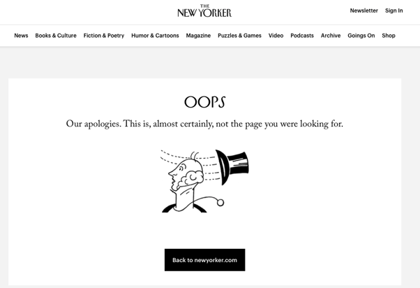
The New Yorker uses a version of its iconic logo graphic to indicate that something is amiss and politely redirects the visitor back toward the main site.
2.The Therapist – If your user has landed on a 404 page and, ultimately, couldn’t find what they were looking for, you can use this as an opportunity to request more information and ask them to communicate with you so that you can answer their specific question personally. Here, you can use a call-to-action like a quick form that they can fill out and send their query to.
Examples:
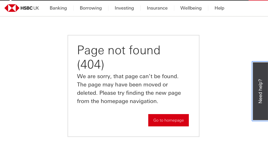
HSBC keeps things clean and professional while making sure the “Need help?” tab is always close by so that visitors can turn to a virtual assistant.
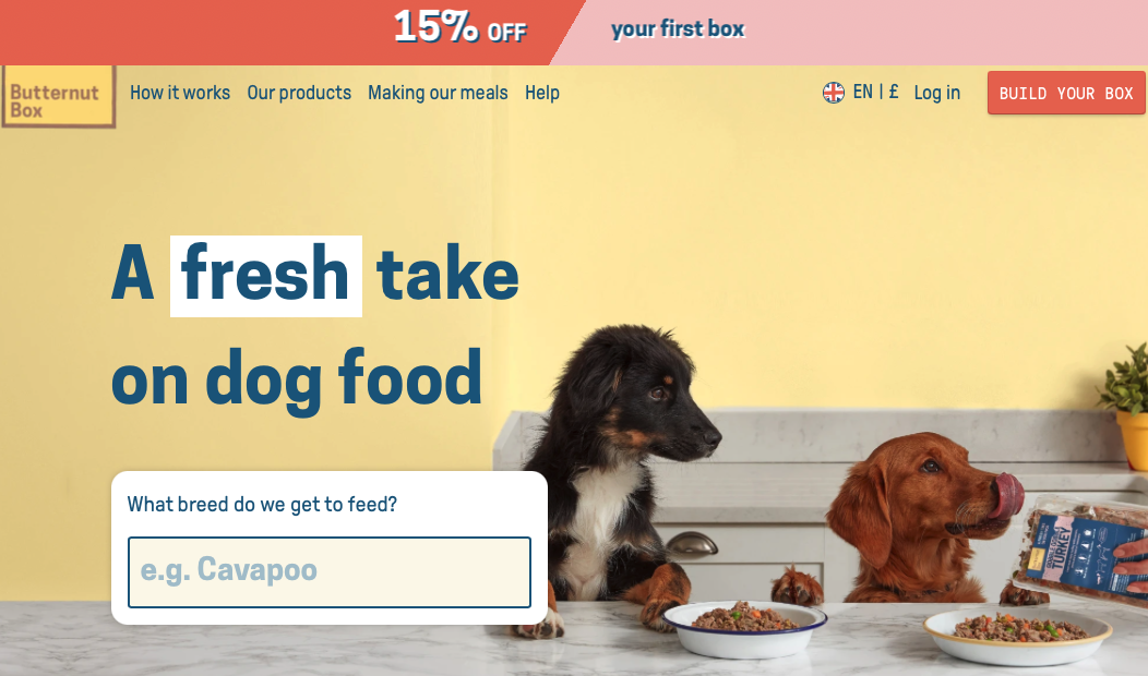
Butternut Box doesn’t even tell you that you’re on a 404 page! They know you’re there looking for dog food (for your beloved fur friend – we hope), and they dive straight into the questions. First off is, “What breed do we get to feed?” Great diversion and a fantastic attempt at refocusing the pet owner on the task at hand: feeding the pooch!
3. The Guide – Of course, you’ll never know what every single person on your website was looking for and how they ended up on the 404 pages. But, you can certainly offer a general sense of direction so they can self-navigate out of the error page. Create a helpful navigation to steer them in the right direction so that you can keep them on your website.
Examples:
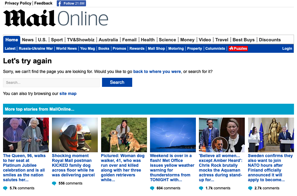
Here's The Daily Mail, offering up a search bar, a full navigation, plus a host of attention-grabbing headlines that will quite easily keep the visitor clicking and reading.
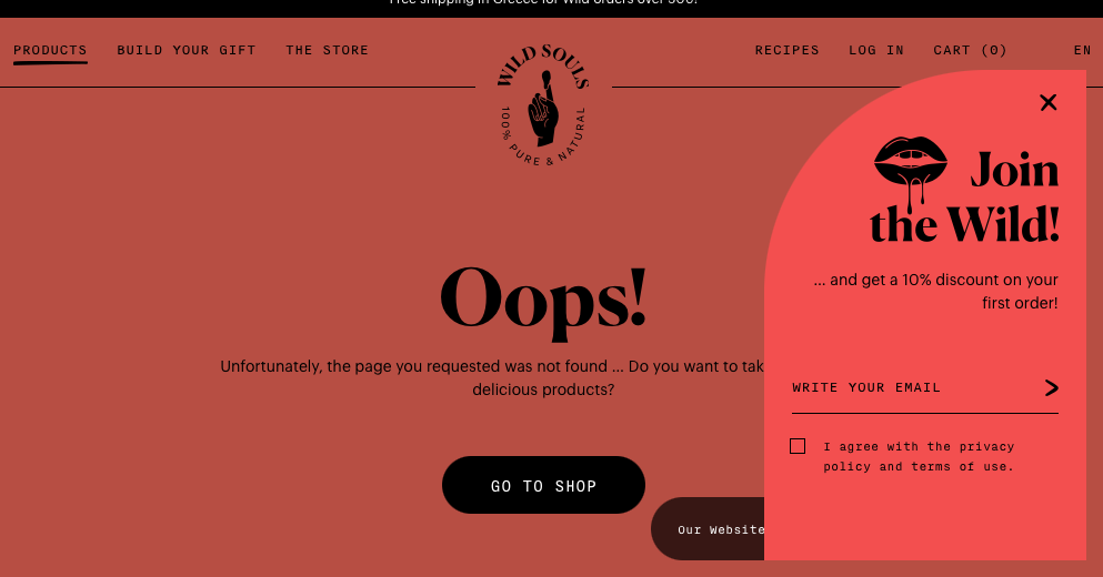
Wild Souls also does a great job of retaining the visitor by directing them back to the shop, keeping the menu bar available at the top, and even enticing the visitor to keep shopping with a discount.
How do 404 pages even happen?
We mentioned the broken link or the page that’s no longer there. But let’s explore how this actually happens.
Your website is stored on a server, where all the content lives. When someone searches for a particular page or clicks a link, sometimes, that page simply isn't found. Now, the guilty party could be you (if you removed a webpage and didn’t change the URL). Or, your website visitor mistyped the URL.
So, if you’ve moved or renamed a webpage, be sure to update the internal link associated with this page so that the old URL is redirected to the new site.
Conclusion
Statistically, the main causes for 404 are typos and outdated bookmarks, so the power isn’t entirely in your hands. What is up to you, as we spoke about before, is to be proactive in practicing good website hygiene and fix broken links, while also ensuring that the user experience (of which 404 pages are a huge part) is on a level.
Remember, 88% of shoppers won’t return to your site if the experience is poor, so putting a little effort and attention into that error page is always a worthwhile investment.
Related Posts

5 Webdesign Trends for 2023
It’s 2023, and the internet is alive with web design trends that are all about creating excellent user experiences (UX). In just five short years, it’s estimated that ...
reading time: 15min
Zum Blog

Orange is the new black: 5 Branding Design Highlights
Welcome to the zesty world of orange! This vibrant hue has been captivating artists and designers for centuries, from the ancient Egyptians who used it to symbolise the ...
reading time: 8min
Zum Blog
HubSpot Marketplace: 5 Great Templates for Your CMS
Without an exceptional website, does your business even exist? It’s your job to create a highly functional and customer-centric digital platform that works day and night ...
reading time: 9min
Zum Blog