Did the last meeting about the data generated by your business activities not reflect what you’re actually experiencing? If you suspect that numbers don’t add up reflect, your instincts may be right. By enhancing the quality of your data, you can start to see a much clearer picture of how your business is performing. To help you, I’ve summed up a few useful recommendations. If you haven't read Part 1 yet, you can find the blog post here.
In my previous blog post, I listed a few things you might pay attention to:- Is my data up to date?
- Do my reports contain multiple data sources?
- How are the data attributes set up? (Data Configuration, UPDATE, DELETE, CREATE)
In this second blog, I expand on these key points:
- How is my data collected?
- How are my metrics calculated?
- Is my report chart the correct one to showcase the learnings?
How is my data collected?
You have one report but how many data sources do you use to compile it and how do you collect them? There are various sources of data; you can upload your data manually or automatically.
- Manual collection of data
Not many businesses collect their data manually anymore, and I’d highly recommend that you avoid this method. For example, by using a physical questionnaire to collect data at an event, you still risk making mistakes. You want to collect e-mail addresses? From experience, I know that some users can't write their e-mail address correctly on a paper. Are you registering the data for the user? You may write some things down incorrectly. In summary, digital forms are far less prone to errors . - Automation collection of data with manual export
You might use digital forms already or your data is automatically collected by a system which you only need to export. Most of the time, people export data in .csv file to refine/clean it. If you have multiple sources on your report, it’s important to pay close attention to the details because the metrics from System A may not entirely match the metrics from System B. You will end up with discrepancies, that's why it's crucial to have matching metrics when comparing data from two systems. - Automation collection of data with synchronisation to another system
I would highly recommend to use this method as it's the most reliable, but also the most time consuming and requires a lot of effort. In order to automate the flow of data running into another system (ideally centralised), you need some specialists such as a business analyst, a system administrator, a developer and possibly a solution architect. Essentially, this is what every good business should be doing with their data sets nowadays.
Once the implementation is done and your team has developed the interface correctly, the data from both systems should match entirely. This is achieved by ensuring that the systems successfully communicate with one another and the data synchrononises to accurately reflect your business.
How are my metrics calculated?
Metrics are the units that will determine how your data will be displayed. How do you usually measure your data? What is the timeframe? What is the currency?
If you are active in a local market, it might be easier to manage your data metrics than in an international context. However, in order to have the big picture, we'll review an international company so you can have a good overview of the actual challenge I'm trying to demonstrate with data metrics.
Let's assume you're in charge of creating reports for three markets: CH - UK - JP. You will need to adjust the currency level (most of the time international companies tend to have an internal fix-rate, so there's no market fluctuation during a fiscal year). Another example, which might be a bit more tricky, is to compare conversion rates. I’ll need to illustrate this with some mathematics:
The CH market does an internal weekly conversion rate report, the UK does it bi-weekly, and the JP does it monthly. How are you going to calculate to compare the data? Are you simply going to add them up and divide by the combined timeframe ? This method would be wrong, and the result would look like this:
| CH | UK | JP |
| Week 1 - 2.5% | Week 1-2 - 3.3% | Week 1-4 - 1.9% |
| Week 2 - 2.6% | Week 3-4 - 2% | |
| Week 3 - 3% | ||
| Week 4 - 1.8% | ||
| Total conversion rate 2.475% | Total conversion rate 2.65% | Total conversion rate 1.9% |
You want to "flatten" your data first and dig deeper into the metrics used to calculate conversions, meaning that you should also consider the units and data driving that conversion rate. Let's assume it was lead/unique page view.
| CH | UK | JP |
| Week 1 - 2.5% (lead 25/page views 1000) | Week 1-2 - 3.3% (lead 33/page views 1000) | Week 1-4 - 1.9% |
| Week 2 - 2.6% (lead 52/page views 2000) | Week 3-4 - 2% (lead 100/page views 5000) | |
| Week 3 - 3% (lead 120/page views 4000) | ||
| Week 4 - 1.8% (lead 9/page views 500) | ||
| Total conversion rate = lead 206/7500 page views = 2.746% | Total conversion rate = lead 133/6000 page views = 2.216% | Total conversion rate 1.9% |
As you can observe CH market has actually a better conversion rate once the data has been flattened. The conclusion is that you should always "flatten" your data with common metrics (convert them into one common metric).
Is my report chart the correct one to showcase the learnings?
Let's focus now on data visualization and how are you going to demonstrate your learnings in the best possible way.
Tables
Tables are probably the most intuitive way to display data as you can really add any type of data with different dimensions. This is a good way to have an overview of your business’performance. My recommendation would be to keep tables clean and display only the most important information. It's not much use if you have a report with a table with 2000 lines or 2000 columns.
Histogram/Bars
This is a great way to show different "products" on one single chart with a timeline. Bars are the best way to showcase if you have a total to calculate for multiple dimensions grouped in a single chart. Let's illustrate this with the evolution of annual sales for three different products from your portfolio and you want to see how they perform.
Pie Chart
A pie chart will only display a full 100% set of data. This is a great way to have a comparison in a bagel/cheese representation (depending on your culture and preference) about one unique dimension! We use it to keep track of relative values and compare them to each other. If you have a dimension with 25 value sources, the pie chart might not be the most suitable one as you'll lose track of the smallest values. I wouldn't recommend it if you have above eight different values––unless you want to group them together if some can be combined. I would also avoid it if I know that 90% of my pie chart will be absorbed by one value (it's like Obélix eating a pie, for those who know "Astérix & Obélix").

Illustration from "Astérix et Cléopâtre", by René Goscinny & Albert Uderzo
Line Chart
It is similar to histogram and bar charts but gives a better representation of one period to another in terms of evolution (increase/decrease). You can have line charts with one dimension or multiple dimensions as well. You must remember to be careful when you combine all these dimensions, however, so that they are the same along both the X and Y axis.
Others: Treemap/Geo Map/Gauge/Funnel
- There are other types of charts which are less common, such as treemaps which are similar to pie charts. Unlike pie charts, however, you might have a bit more information on the chart for dominant values.
- Geo Maps are a wonderful way to showcase a dimension with a geographical area. It's most often represented with dots which are then represented on the map by size.
- If you want to set a goal for your KPI, you would then use a gauge to keep track of your performance. Your goal would be set to 100% (full bar), and the current % will simply set your actual performance.
- A funnel chart might be a bit more difficult to set up as it might involve data from multiple sources, but it's a wonderful way to see the flow from one step to another with the percentage of conversion. It gives a lot of insights about how well your customers are converting in the workflow as you might be able to identify the bottleneck in the customer journey.
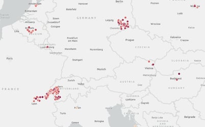
Figure 1: example of Geomap with intensity dots to measure two dimensions at the same time
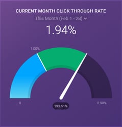
Figure 2: example of gauge to keep your KPI under control
Thanks for reading! This second part was a bit more technical than the first article, but I hope it gave you a better understanding on how to handle data and avoid mistakes on your report. If you're interested to work on a project with us, just click here:

Comment
Related Posts

Why your reports might not reflect the reality of your business (Part 1)
Have you ever been in a meeting where all the reports show you outstanding numbers and only green lights? You wonder how that could be possible when your experience on ...
reading time: 9min
Zum Blog
Improved HubSpot Reporting with Databox
Your business collects data from so many different sources. It's the blessing and the curse of the digital age we find ourselves in. On the one hand, you have more ...
reading time: 7min
Zum Blog

Data Mapping: Better Insights to Make Data-Based Decisions
In a world that treats data as the new gold, data-driven organisations don't just have a competitive edge; they're practically in a league of their own. Studies show ...
reading time: 10min
Zum Blog